The Importance of Interior Design for Self-Published Books

ebooks

The self-publishing industry has come a long way since the early 2000’s. Back then, self-publishing a book carried a huge stigma, but today, more books are self-published than traditionally published, and more self-published books are purchased than traditionally published books.  Yet, in many readers’ minds, the stigma still exists because self-published books are so often inferior to traditionally published books.

What can a professional self-published author do to overcome this mindset?

  1. Don’t worry about your publisher.  The vast majority of readers do not care who your publisher is. They won’t look at who published your book when deciding whether or not to buy it. So any fear you have about a stigma that is associated with your self-publisher of choice is unwarranted.  
  2. Invest in a custom cover design.  The first thing a potential buyer will see is your book cover. And the book cover is the single easiest way to tell if a book is self-published or not.  If asked, most people might not even be able to describe why a cover looks amateurish; but it doesn’t matter – an amateur cover will scream “self-published” to potential buyers and due to that stigma, they may shy away.
  3. Invest in professional interior formatting. The vast majority of self-published books are purchased from Amazon, and most of them feature the “look inside” element, which allows shoppers to view pages from within the book.  The interior of your book is the second way potential customers recognize self-published books. Interiors that are formatted by computers look like they were formatted by computers, and that makes them look like amateur, self-published books. Even worse, it looks like the author doesn’t care about what the book looks like.  If the author doesn’t even care what the book looks like, why should a potential reader buy it?

good-vs-bad-book-design_new

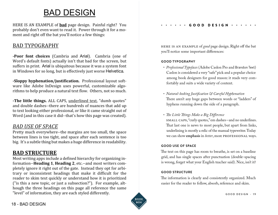
After the cover design, the interior design of your book is what separates most professional self-published books from “free” self-published books. Professional self-published books, like those published by full-service self-publishing providers, feature interior designs formatted by human beings.  “Free” self-published books, on the other hand, feature interior designs formatted by computers. The difference, when compared side by side, is staggering. Don’t allow your book to look amateurish and cheap by allowing a computer algorithm to format it for you. Your potential buyers will notice. They may not care who published it; they may think the cover looks great; but without a professional interior, they’re still going to know your book is self-published with just a glance. And, as a result, they’re going to think twice about ordering it.

Fortunately, it’s easy to make your book interior look professional.  Nearly all full-service self-publishing providers will professionally format your interior as a part of their publishing package fees.  And most will offer you the opportunity of “enhanced” or “custom” interior designs. Don’t pass on this opportunity lightly. While the standard interior formatting offered by most full-service providers is certainly better than anything a computer can do at those “free” places, enhanced or upgraded interior designs typically go one or two steps further – by integrating design elements, unique styles, and customizations to truly make your book one-of-a-kind. The improvement is usually worth the cost of admission.

Page-by-page custom interior designs are best suited for children’s books, or complex literature where the book itself is a work of art, like with some poetry or coffee table books. Rarely does a page-by-page custom design suit a typical black/white fiction or non-fiction work of average length (100-300 pages).  The result just doesn’t justify the cost.

When it comes to selecting a standard, included interior, do some research. Look at similar books in your genre and choose a similar style for your book.  While a cover should be unique and eye-catching, you don’t want your interior to rock the boat. Give the reader what they expect.

If you choose to enhance or upgrade your interior for a professional format that is more customized to your book and vision, work with your designer closely, and heed his/her advice. After all, this is what they do for a living; they know what they’re doing and their recommendations are worth their weight in gold. If you have a particular vision that contradicts your designer’s recommendations, have a strong, valid reason for going against conventions.  

If you choose to publish with a “free” publishing service, format your book in advance and save it as a PDF file. Do not allow their computers to “format” your book for you. That’s a sure way to make your book look self-published and, worse of all, cheap.  While formatting a book in Word is acceptable, and certainly preferable to computers, the better alternative is to use design software like inDesign. This is what professional designers use and this is what professional publishers use. Yes, your book’s interior design is that important. Most writers do not know how to design a book in inDesign, which, of course, is why most professional self-published authors use full-service publishing providers.


brent sampson
In 2002, Ernst & Young Entrepreneur of the Year Semi-Finalist Brent Sampson founded Outskirts Press, a custom book publishing solution that provides a cost-effective, fast, and powerful way to help authors publish, distribute, and market their books worldwide while leaving 100% of the rights and 100% of the profits with the author. Outskirts Press was incorporated in Colorado in October, 2003.
In his capacity as the Chief Executive Officer and Chief Marketing Officer, Brent is an expert in the field of book publishing and book marketing. He is also the author of several books on both subjects, including the bestseller Sell Your Book on Amazon, which debuted at #29 on Amazon’s bestseller list.

In Your Corner: The Proof is in the Pudding

Get it?  We’re going talk about book proofs this week as a part of our ongoing series about choices–the choices you make as a self-publishing author in the midst (and mist!) of an often long and complicated process.  Previous entries in this series have included “Choosing a Self-Publishing Company,” “Choosing a Trim Size for Your Book,” figuring out how to “Know Thyself (& Thy Genre),” “Settling on a Price,” “Choosing a Cover,” and last week’s exploration of what we called “The Guts of the Thing” and which essentially boiled down to interior design–illustrations and formatting.  The assumption with last week’s post was that if you struggle to summon up the skills, time, or energy to worry about the graphic design components of your book, you can theoretically find assistance from exterior (and even paid professional) sources.

But what about proofing your book?

Proofing Your Book

That thing we all hate and try not to think about.

book proofing

Here’s the deal with proofing:

It’s not really something you want to outsource, even to a professional.  Copyediting, yes, but proofing … less so.  This is because the proof is the final step before actual publication, and it’s important that you be the last person to lay eyes on it before it goes to the presses.  It was your vision, after all, that led to its creation–and you want to make sure that it is your vision, in the end, which guides it to completion.

This is the moment of truth.  So how do events unfold?

The printed proof arrives on your doorstep, or in your mailbox, or perhaps you’re overexcited and actually show up at the printer’s to get it.  The point is, it’s in your hot little hands and ready to go.  Almost.

Up to this moment, the book you’ve been dreaming about and actively shaping has only ever been real to you in the way that pixels and Microsoft Word documents are real.  Maybe you’ve printed off a copy, to get a better look at layouts and formatting and illustrations and typography–but that’s not really the same thing as a finished book, is it?

And trust me, after that initial shiver of anticipation passes, it’s time to pull out the red pen, because there’s always something that’s slipped through the cracks and that needs addressing before you click the final keys or give your Publishing Consultant the final go-ahead.  Your proof is, as its name implies, the evidence that you’ve done everything correctly.  Or it ought to be.  As I said, your first proof is usually an exercise in addressing little errors that were invisible on your computer screen or in printouts but that, in printed form, pop off of the page.  It could be an incorrect font, a weird space, typographical errors, a misaligned paragraph–anything.  As perfect as your last manuscript was in digital form, sometimes it doesn’t translate perfectly to the printed page.


What should I watch out for?

First of all, take a deep breath.  Now, let it out.  Proofing can be painful in some ways, mostly because you’re having to spend more time obsessing over the minutiae of your book, but it’s worth it.  A few tips and tricks and mistakes to watch out for, and your book will look and feel as good as if it had gone through the entire rigmarole that traditionally published books have to.

  • Step One: Read your book like a book.

Just go for it.  Read the whole thing through, start to finish, checking for common typographical errors and inconsistencies as you would in reading a normal draft.  Check that the text is complete, and that no paragraphs are missing or sentences cut off by a page break.  Only you, the book’s author, are going to catch omissions like that.  And while you’re reading, keep an eye out for odd or inconsistent use of fonts, punctuation (particularly hyphens and the “curled” version of quotation marks), as well as line and word spacing.  You can pass the book on to someone else to double-check your impression on these last points, too–that never hurts.

  • Step Two: Squint and stare.

Once, in college, I was taking an illustration course and my professor gave me one of the most important pieces of advice I’ve ever heard: “Step back from what you’re working on, squint so that everything is just a touch blurry, and see what’s missing.”  By stepping back and letting things get a touch blurry, you as an author and artist are ignoring the content of the text and seeing it for what it is in addition to being a story: a collection of visual components.  You’ll be better able to spot orphans and widows (single lines at the bottom or top of a page), inconsistencies in running heads and chapter or part titles, and the dimensions and placement of graphic elements like illustrations, page numbers, chapter openers, and so on.  Double check that odd-numbered pages are on the right hand side of the centerfold.  Double check your references and footnotes if you have them–that they’re there, and that they’re on the right page–as well as the consistency of your paragraph indents and other alignments.

  • Step Three: Turn it over. And over.

Try it.  The front and back covers of your books should look exactly as you requested or input them to be, and they should meet your exact specifications of color, contrast, clarity, and placement.  The barcode, ISBN, blurbs, description, biographic information, and other nuts and bolts should all be in place, attractive, and correct in spelling and form like the rest of your book.

*****

Proofing your book isn’t simply a matter of going through the motions.  It’s vitally important that you care about this stage of the process the same way you care about every other stage–if you go through the trouble of correcting a proof and upload your revisions, you’ll have no doubts when it comes time to send your book out into the world to its new readers.  You’ll face whatever comes next with confidence, pride, and a sense of intrepid adventure.  And next week, we’re going to look at what some of those steps might be!

You are not alone. ♣︎


Elizabeth

ABOUT ELIZABETH JAVOR: With over 18 years of experience in sales and management, Elizabeth Javor works as the Manager of Author Services for Outskirts Press. The Author Services Department is composed of knowledgeable publishing consultants, pre-production specialists, customer service reps and book marketing specialists; together, they all focus on educating authors on the self-publishing process to help them publish the book of their dreams. Whether you are a professional looking to take your career to the next level with platform-driven non-fiction or a novelist seeking fame, fortune, and/or personal fulfillment, Elizabeth Javor can put you on the right path.

The Book Beautiful: Summary Edition

The past six weeks we’ve been looking in depth at all of the steps that it takes to turn a manuscript into a polished, professional, finished copy of a book. As we’ve learned, this is a complex process full of choices such as whether or not to go with hard or soft cover, what cover illustration to use to draw in your readers, what information to include in your front and back matter, how will you format your text and your back cover, will you illustrate your piece, etc. etc. This process can be long and daunting, especially as a self-published author, which is why we at Outskirts Press want to assist our authors through it with our advice on this blog, but also with our hands-on services as a company.

*****

I’d like to wrap up the last six weeks by evaluating what it is I think authors should take away from each in depth look we took at the different aspects of bringing a text to life. It seems critical to note that each of the choices you make while publishing all answer to a reader’s unconscious sensuous experience of picking up your book in a store. Each choice you make when formatting or designing the final copy of your book is something that a reader will be assessing from the minute they walk by it on the shelf, to the first time they pick it up in their hands, thumb through the pages, read the back, and decide whether or not to bring it to the counter to purchase it. This is really about first impressions, and we all know how important it is to make a good one when someone’s approval is important to us.

first impressions
[ first impressions matter ]
What is the first thing a potential reader will notice about your book when they walk by? Presumably if it is hard or soft cover. Do you need to go with a hard cover to look professional? Certainly not. In fact, it seems that the chance of selling your book in soft cover is much higher. The next thing to make an impression after someone has read your title and pulled the book of the shelf will most likely be the cover illustration. I feel I gave some entertaining examples of what not to do, but the best advice I feel I could give is again, use something that embodies your theme and draws in your target audience. Also, remember that less is more, don’t clutter the cover with unnecessary or flamboyant text or illustrations.

As far as formatting the interior of your book is concerned, remember that the status quo is usually the way to go here. You don’t necessarily want the formatting of your book to stick out, but to ‘fit in’ to what people expect to see when they open a book. That’s not to say that you don’t have some creative freedom when it comes to formatting the text and illustrations (the standards of which often vary from genre to genre), but going out on a whim with a bizarre font choice is not necessarily a wise idea either. Remember that you have creative liberty with which front and end matter you want to include, such as a personalized dedication, epigraph, acknowledgements, bio, etc.

Lastly, and perhaps most importantly, don’t forget how critical the back cover of your book is. With the 150-200 words you have to sell a reader your story, you get more space than let’s say…a Tweet, but not much more. Make it exciting without giving anything away.

Remember that these aren’t decisions you have to make alone. If you have questions beyond what has been provided in these blogs, don’t hesitate to contact one of our professional, knowledgeable representatives at Outskirts Press. Our experience as writers helps us guide new authors toward the best decisions. We will always put our authors first.


Thank you for reading!  If you have any questions, comments, suggestions, or contributions, please use the comment field below or drop us a line at selfpublishingadvice@gmail.com.  And remember to check back each Wednesday for your weekly dose of marketing musings from one indie, hybrid, and self-published author to another. ♠


Kelly

ABOUT KELLY SCHUKNECHT: Kelly Schuknecht is the Executive Vice President of Outskirts Press. In addition to her contributions to the Outskirts Press blog at blog.outskirtspress.com, Kelly and a group of talented marketing experts offer book marketing services, support, and products to not only published Outskirts Press authors, but to all authors and professionals who are interested in marketing their books and/or careers. Learn more about Kelly on her blog, kellyschuknecht.com

The Book Beautiful: The Back Cover

It’s More Than a Graveyard for Details

A potential reader has your book in their hands, they look at the front illustration, they flip through and subconsciously note how the book it formatted, and then they turn the book around to read the back cover. The back cover becomes a crucial piece for a reader deciding whether or not they are going to purchase your book. You essentially have 150-200 words to sell your story to the reader, anything more than that will appear cluttered or have to be excruciatingly small in order to fit, alienating some potential readers who didn’t bring a magnifying glass along with them to the bookstore.That being said, a great thing to do before you begin brainstorming the back cover of your own book is to go through your own library and look at the back covers of some of your favorite books for reference.

Is your book fiction? If so, provide a short summary of what the story is about, including some enticing plot points to hook your reader in (don’t give the ending away!). An exciting way to end your back cover blurb is with a question or introducing a point of tension that the reader will feel compelled to explore further.

Is your book nonfiction? Begin by addressing the primary purpose of your book, or the ‘why’ a reader should choose your book. Proceed by making a bullet-point list of the topics your book will cover, i.e. what the reader can gain from reading your book.

Once your blurb is written, it’s time to introduce yourself as an author. A professional photograph of yourself (a face shot with no background noise, the focus is on you here) with a short bio is another essential component of a back cover. This bio won’t be as detailed as the formal bio on a page inside the book (or book jacket if a hardcover), and is not meant to be. If you are a nonfiction writer, this is a good place to list your qualifications, experience, or training in the area you’ve written about.

Endorsements are another appropriate feature to add to your back cover if you have them. An endorsement is just a short little quip written by a well-respected author in your genre (if fiction) or professional in your field (if nonfiction). If you don’t have someone well-known to endorse your book, it is best to omit this feature as it will simply look like you couldn’t obtain a more reputable endorsement and instead settled for anything.

If you’re struggling with any of the components of your back cover, Outskirts Press’ one click publishing package includes a personalized back cover that is professional and polished and relieves you of the stress of choosing the right few words to include to reel in potential readers.


Thank you for reading!  If you have any questions, comments, suggestions, or contributions, please use the comment field below or drop us a line at selfpublishingadvice@gmail.com.  And remember to check back each Wednesday for your weekly dose of marketing musings from one indie, hybrid, and self-published author to another. ♠


Kelly

ABOUT KELLY SCHUKNECHT: Kelly Schuknecht is the Executive Vice President of Outskirts Press. In addition to her contributions to the Outskirts Press blog at blog.outskirtspress.com, Kelly and a group of talented marketing experts offer book marketing services, support, and products to not only published Outskirts Press authors, but to all authors and professionals who are interested in marketing their books and/or careers. Learn more about Kelly on her blog, kellyschuknecht.com

In Your Corner: Choosing a Trim Size for Your Book

Decisions, Decisions

(where would we be without decisions?)

When it comes to choosing the form in which your book will be sent forth into the world–hardcover, paperback, small, or large–it’s the rare author who has considered the book’s actual trim size.  Those other elements?  They’re easy to visualize in your head, to picture your book as taking one such form.  Trim size is not so easy, in part because many authors don’t even know what the term means.

trim size definition

Thanks to Dictionary.com, we can safely interpret trim size to mean the page area left after final production is completed–which is not the same thing as the page area throughout the printing process.  While a book is being printed, the pages are slightly larger than their final size.  Once your content has been printed, the pages are cut down to their final size–their trim size.

Depending on which self-publishing company you choose, you ought to have a choice of trim sizes to select from.  Print on Demand (POD) options will often constrain your choices simply because each size uses its own machinery, so the more sizes on offer = the more expensive the machinery is to purchase and maintain for the operator, and ultimately, the end user–you.

There are so many sizes to choose from, it almost boggles the mind.The most common trade paperback sizes, for example, run from 6″ by 9″ to 5.5″ by 8.5″, but you’ll also see 5.25″ by 8″ and 5″ by 8″ in some POD services. It’s not unheard of to choose even larger sizes–6″ by 9″, 7″ by 10″, 8.25″ by 8.25, or even 8″ by 10″–especially if you’re working within the children’s picture book or technical manual markets.

trim size
[ a pleasant-looking trim size ]
Sometimes the decision might be self-explanatory.  If you’re a photographer, for example, it makes sense to go with a larger trim size to allow your images to be shown off to greatest effect.  But why does size–or even deciding between hardcover and paperback– matter at all to everyone else?  The answer boils down to reader perception, and reader perception can be greatly affected by the minutiae.  A nice balance between text and white space, for example, is a subconscious clue that the author took great pains to be professional while designing their book.  A crowded page, while maximizing the text-to-page ratio and lowering the total page count (and therefore cost) of a book, looks clunky and dense, making it difficult to read.  Similarly, a hardcover book is a sign that, on a fundamental level, the author cares about creating a durable, treasured possession–while a paperback enables portability and a voracious consumption of words.

Think about how your book will be used, and by whom, and what the typical expectations are within a genre.  Fiction titles typically run in smaller trim sizes, since readers typically read them for pleasure–whether on the train to work in the morning, or while sitting on the back porch.  Nonfiction titles, including memoirs and the ever-growing Creative Non-Fiction (CNF) field typically run in the middle of the pack–unless they’ve been penned by someone famous, like a film or a football star.  Those are often oversized, just like the personalities they describe.  Technical manuals, cookbooks, photography tabletop books, and children’s picture books are always the largest books on the shelf–and often, they are used while lying flat on a table or the floor.

I guess my recommendation is rather simple: take a ruler with you to the bookstore and library.  Measure the books that fall within the “if you like my book, you might also like X book” category, whether you’re thinking of similarities in genre or thematic content.  Weigh it in your hand.  Are you more likely to pick up the hardcover or the paperback of that book?  And don’t just measure the outside cover.  Look inside–at the trim size, the the margins.  It may not be an easily quantifiable thing, but readers are most likely to buy books that strike them as visually balanced and attractive–and the trim size of a book contributes to this a great deal!

You are not alone. ♣︎

*  And when Thomas himself took the poem seriously and made some rather intense life choices–for example, going off to WWI–Frost was devastated.  He was even more devastated when Thomas died in Arras.  The moral of this story being, it would seem, to make major life decisions upon thorough research and consideration, not the (misread) interpretation of a poem.

Elizabeth

ABOUT ELIZABETH JAVOR: With over 18 years of experience in sales and management, Elizabeth Javor works as the Manager of Author Services for Outskirts Press. The Author Services Department is composed of knowledgeable publishing consultants, pre-production specialists, customer service reps and book marketing specialists; together, they all focus on educating authors on the self-publishing process to help them publish the book of their dreams. Whether you are a professional looking to take your career to the next level with platform-driven non-fiction or a novelist seeking fame, fortune, and/or personal fulfillment, Elizabeth Javor can put you on the right path.