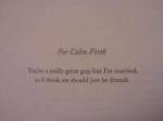
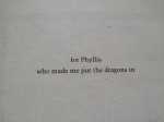
In Your Corner: The Proof is in the Pudding

Get it?  We’re going talk about book proofs this week as a part of our ongoing series about choices–the choices you make as a self-publishing author in the midst (and mist!) of an often long and complicated process.  Previous entries in this series have included “Choosing a Self-Publishing Company,” “Choosing a Trim Size for Your Book,” figuring out how to “Know Thyself (& Thy Genre),” “Settling on a Price,” “Choosing a Cover,” and last week’s exploration of what we called “The Guts of the Thing” and which essentially boiled down to interior design–illustrations and formatting.  The assumption with last week’s post was that if you struggle to summon up the skills, time, or energy to worry about the graphic design components of your book, you can theoretically find assistance from exterior (and even paid professional) sources.

But what about proofing your book?

Proofing Your Book

That thing we all hate and try not to think about.
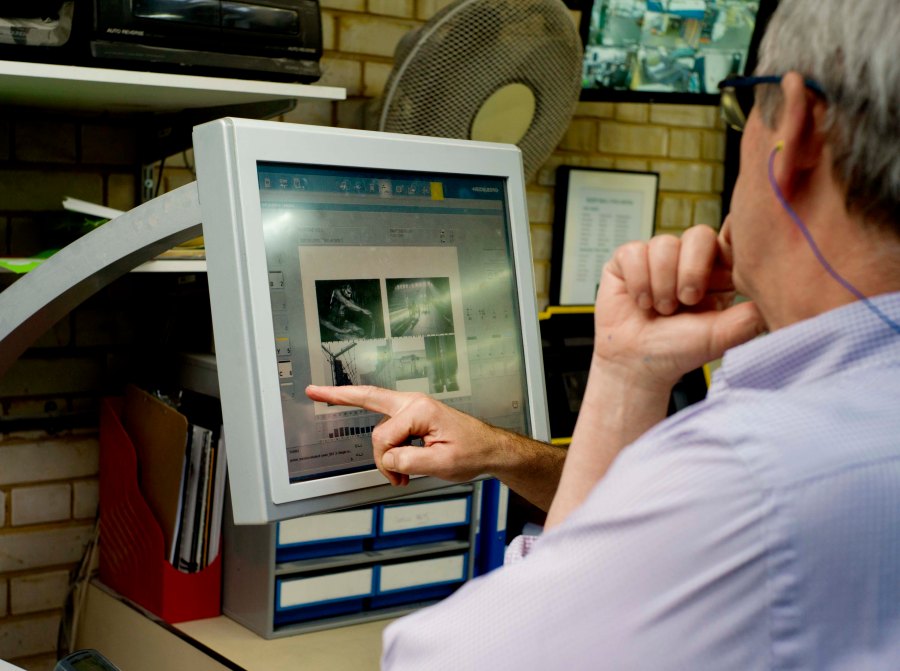
book proofing

Here’s the deal with proofing:

It’s not really something you want to outsource, even to a professional.  Copyediting, yes, but proofing … less so.  This is because the proof is the final step before actual publication, and it’s important that you be the last person to lay eyes on it before it goes to the presses.  It was your vision, after all, that led to its creation–and you want to make sure that it is your vision, in the end, which guides it to completion.

This is the moment of truth.  So how do events unfold?

The printed proof arrives on your doorstep, or in your mailbox, or perhaps you’re overexcited and actually show up at the printer’s to get it.  The point is, it’s in your hot little hands and ready to go.  Almost.

Up to this moment, the book you’ve been dreaming about and actively shaping has only ever been real to you in the way that pixels and Microsoft Word documents are real.  Maybe you’ve printed off a copy, to get a better look at layouts and formatting and illustrations and typography–but that’s not really the same thing as a finished book, is it?

And trust me, after that initial shiver of anticipation passes, it’s time to pull out the red pen, because there’s always something that’s slipped through the cracks and that needs addressing before you click the final keys or give your Publishing Consultant the final go-ahead.  Your proof is, as its name implies, the evidence that you’ve done everything correctly.  Or it ought to be.  As I said, your first proof is usually an exercise in addressing little errors that were invisible on your computer screen or in printouts but that, in printed form, pop off of the page.  It could be an incorrect font, a weird space, typographical errors, a misaligned paragraph–anything.  As perfect as your last manuscript was in digital form, sometimes it doesn’t translate perfectly to the printed page.


What should I watch out for?

First of all, take a deep breath.  Now, let it out.  Proofing can be painful in some ways, mostly because you’re having to spend more time obsessing over the minutiae of your book, but it’s worth it.  A few tips and tricks and mistakes to watch out for, and your book will look and feel as good as if it had gone through the entire rigmarole that traditionally published books have to.

  • Step One: Read your book like a book.

Just go for it.  Read the whole thing through, start to finish, checking for common typographical errors and inconsistencies as you would in reading a normal draft.  Check that the text is complete, and that no paragraphs are missing or sentences cut off by a page break.  Only you, the book’s author, are going to catch omissions like that.  And while you’re reading, keep an eye out for odd or inconsistent use of fonts, punctuation (particularly hyphens and the “curled” version of quotation marks), as well as line and word spacing.  You can pass the book on to someone else to double-check your impression on these last points, too–that never hurts.

  • Step Two: Squint and stare.

Once, in college, I was taking an illustration course and my professor gave me one of the most important pieces of advice I’ve ever heard: “Step back from what you’re working on, squint so that everything is just a touch blurry, and see what’s missing.”  By stepping back and letting things get a touch blurry, you as an author and artist are ignoring the content of the text and seeing it for what it is in addition to being a story: a collection of visual components.  You’ll be better able to spot orphans and widows (single lines at the bottom or top of a page), inconsistencies in running heads and chapter or part titles, and the dimensions and placement of graphic elements like illustrations, page numbers, chapter openers, and so on.  Double check that odd-numbered pages are on the right hand side of the centerfold.  Double check your references and footnotes if you have them–that they’re there, and that they’re on the right page–as well as the consistency of your paragraph indents and other alignments.

  • Step Three: Turn it over. And over.

Try it.  The front and back covers of your books should look exactly as you requested or input them to be, and they should meet your exact specifications of color, contrast, clarity, and placement.  The barcode, ISBN, blurbs, description, biographic information, and other nuts and bolts should all be in place, attractive, and correct in spelling and form like the rest of your book.

*****

Proofing your book isn’t simply a matter of going through the motions.  It’s vitally important that you care about this stage of the process the same way you care about every other stage–if you go through the trouble of correcting a proof and upload your revisions, you’ll have no doubts when it comes time to send your book out into the world to its new readers.  You’ll face whatever comes next with confidence, pride, and a sense of intrepid adventure.  And next week, we’re going to look at what some of those steps might be!

You are not alone. ♣︎


Elizabeth

ABOUT ELIZABETH JAVOR: With over 18 years of experience in sales and management, Elizabeth Javor works as the Manager of Author Services for Outskirts Press. The Author Services Department is composed of knowledgeable publishing consultants, pre-production specialists, customer service reps and book marketing specialists; together, they all focus on educating authors on the self-publishing process to help them publish the book of their dreams. Whether you are a professional looking to take your career to the next level with platform-driven non-fiction or a novelist seeking fame, fortune, and/or personal fulfillment, Elizabeth Javor can put you on the right path.

In Your Corner: Choosing a Trim Size for Your Book

Decisions, Decisions

(where would we be without decisions?)

When it comes to choosing the form in which your book will be sent forth into the world–hardcover, paperback, small, or large–it’s the rare author who has considered the book’s actual trim size.  Those other elements?  They’re easy to visualize in your head, to picture your book as taking one such form.  Trim size is not so easy, in part because many authors don’t even know what the term means.

trim size definition

Thanks to Dictionary.com, we can safely interpret trim size to mean the page area left after final production is completed–which is not the same thing as the page area throughout the printing process.  While a book is being printed, the pages are slightly larger than their final size.  Once your content has been printed, the pages are cut down to their final size–their trim size.

Depending on which self-publishing company you choose, you ought to have a choice of trim sizes to select from.  Print on Demand (POD) options will often constrain your choices simply because each size uses its own machinery, so the more sizes on offer = the more expensive the machinery is to purchase and maintain for the operator, and ultimately, the end user–you.

There are so many sizes to choose from, it almost boggles the mind.The most common trade paperback sizes, for example, run from 6″ by 9″ to 5.5″ by 8.5″, but you’ll also see 5.25″ by 8″ and 5″ by 8″ in some POD services. It’s not unheard of to choose even larger sizes–6″ by 9″, 7″ by 10″, 8.25″ by 8.25, or even 8″ by 10″–especially if you’re working within the children’s picture book or technical manual markets.

trim size
[ a pleasant-looking trim size ]
Sometimes the decision might be self-explanatory.  If you’re a photographer, for example, it makes sense to go with a larger trim size to allow your images to be shown off to greatest effect.  But why does size–or even deciding between hardcover and paperback– matter at all to everyone else?  The answer boils down to reader perception, and reader perception can be greatly affected by the minutiae.  A nice balance between text and white space, for example, is a subconscious clue that the author took great pains to be professional while designing their book.  A crowded page, while maximizing the text-to-page ratio and lowering the total page count (and therefore cost) of a book, looks clunky and dense, making it difficult to read.  Similarly, a hardcover book is a sign that, on a fundamental level, the author cares about creating a durable, treasured possession–while a paperback enables portability and a voracious consumption of words.

Think about how your book will be used, and by whom, and what the typical expectations are within a genre.  Fiction titles typically run in smaller trim sizes, since readers typically read them for pleasure–whether on the train to work in the morning, or while sitting on the back porch.  Nonfiction titles, including memoirs and the ever-growing Creative Non-Fiction (CNF) field typically run in the middle of the pack–unless they’ve been penned by someone famous, like a film or a football star.  Those are often oversized, just like the personalities they describe.  Technical manuals, cookbooks, photography tabletop books, and children’s picture books are always the largest books on the shelf–and often, they are used while lying flat on a table or the floor.

I guess my recommendation is rather simple: take a ruler with you to the bookstore and library.  Measure the books that fall within the “if you like my book, you might also like X book” category, whether you’re thinking of similarities in genre or thematic content.  Weigh it in your hand.  Are you more likely to pick up the hardcover or the paperback of that book?  And don’t just measure the outside cover.  Look inside–at the trim size, the the margins.  It may not be an easily quantifiable thing, but readers are most likely to buy books that strike them as visually balanced and attractive–and the trim size of a book contributes to this a great deal!

You are not alone. ♣︎

*  And when Thomas himself took the poem seriously and made some rather intense life choices–for example, going off to WWI–Frost was devastated.  He was even more devastated when Thomas died in Arras.  The moral of this story being, it would seem, to make major life decisions upon thorough research and consideration, not the (misread) interpretation of a poem.

Elizabeth

ABOUT ELIZABETH JAVOR: With over 18 years of experience in sales and management, Elizabeth Javor works as the Manager of Author Services for Outskirts Press. The Author Services Department is composed of knowledgeable publishing consultants, pre-production specialists, customer service reps and book marketing specialists; together, they all focus on educating authors on the self-publishing process to help them publish the book of their dreams. Whether you are a professional looking to take your career to the next level with platform-driven non-fiction or a novelist seeking fame, fortune, and/or personal fulfillment, Elizabeth Javor can put you on the right path.

The Book Beautiful: Front & Back Matter (It Matters!)

So you’ve written a manuscript, thus the ‘meat’ of your book is complete. However, you want to happily sandwich that meat between what we call ‘front matter’ and ‘back matter.’ Front matter includes things like the half-title, the title page, the copyright page, a dedication, acknowledgements, a table of contents, and perhaps other things such as an epigraph, a preface, an introduction, or a prologue. The back matter can include an index, an appendix, and other material that doesn’t belong in the meat of the book, but that you’d like to include to feel you have a complete book.

First, let’s break down what front and back matter should include and how to make them look professional and appropriate. We’ll begin by tackling the different types of front matter you can choose to include.


  • Half Title –  As writers, you’re probably (and hopefully!) avid readers yourself, so you know that typically the first page of a book tends to just contain the title of the book. No author name, no other clutter, just a straightforward, bold texted title.
  • Title Page – The title page will also include the title of the book, but it will also include a subtitle (if you have one), the author’s name, as well as the name of the publishing company of the book. Other details that are often found on this page would be the location of the publishing house, the year the book was published, and perhaps even an illustration.
  • Copyright Page – You’ll usually find the copyright page by simply flipping the title page, and it will have a copyright notice, edition information, cataloging data, publication information, legal notices, and your book’s ISBN.
  • Dedication Page – This page will typically follow your copyright page and can be as simple as…


For my dearest mother Mary: R.I.P.

Or they can be witty…

“I dedicate this book to George W. Bush, my Commander-in-Chief, whose impressive career advancement despite remedial language skills inspired me to believe that I was capable of authoring a book.”

Pedram Amini, ‘Fuzzing: Brute Force Vulnerability Discovery’

Or they can be touching…

“Dear Pat,

You came upon me carving some kind of little figure out of wood and you said, “Why don’t you make something for me?”

I asked you what you wanted, and you said, “A box.”

“What for?”

“To put things in.”

“What kind of things?”

“Whatever you have,” you said.

Well, here’s your box. Nearly everything I have is in it, and it is not full. Pain and excitement are in it, and feeling good or bad and evil thoughts and good thoughts- the pleasure of design and some despair and the indescribable joy of creation.

And on top of these are all the gratitude and love I have for you.

And still the box is not full.”

–John Steinbeck, ‘East of Eden


  • Acknowledgements Page – This is where you can express your appreciation for all of those who helped you create the book.
  • Table of Contents – The table of contents is where you list all the major divisions within your book, more often than not in the form of chapters. The length of your book will determine how detailed your table of contents will need to be–a longer book will typically require a more detailed table of contents to assist your reader in navigating the piece.
  • Epigraph – An epigraph is a quotation that you can choose to devote an entire page to (usually facing the table of contents), or that you can choose to put at the start of the first chapter.
  • Preface – A preface is place for the author to explain how the book came into being and is often signed and dated by the author.
  • Introduction – Here the author can explain the goals of the work, place the work in context, or explain the organization and scope of the work.
  • Prologue – A prologue is told from the voice of a character in the book, and not the author’s own. It is typically used in a piece of fiction to set the scene for the story that is about to unfold.

As for the back matter of your book,

  • Index – An index will act as a guide to the book itself; it provides an alphabetized list of terms in the text and will indicate where in the text these terms were used.
  • Appendix – An appendix will provide supplementary details about your book such as corrections, updates, and details.


Now these are merely suggestions for what you can choose to include in the front and back matter of your book. What is most important is that what you do include looks professional and is well formatted. Pick up multiple books from your shelf and take a look at the front and back matter for a point of reference. While you’ve probably skipped over it on most books you’ve read, think how much more legitimate books with these sections look than books without them. These parts of publishing may seem tedious, but as I’ve said before, they are what will transform your manuscript into a book.


Thank you for reading!  If you have any questions, comments, suggestions, or contributions, please use the comment field below or drop us a line at selfpublishingadvice@gmail.com.  And remember to check back each Wednesday for your weekly dose of marketing musings from one indie, hybrid, and self-published author to another. ♠


Kelly

ABOUT KELLY SCHUKNECHT: Kelly Schuknecht is the Executive Vice President of Outskirts Press. In addition to her contributions to the Outskirts Press blog at blog.outskirtspress.com, Kelly and a group of talented marketing experts offer book marketing services, support, and products to not only published Outskirts Press authors, but to all authors and professionals who are interested in marketing their books and/or careers. Learn more about Kelly on her blog, kellyschuknecht.com

The Book Beautiful: Formatting the Masterpiece

As you finish your manuscript and move toward the stage of publishing, the layout of the inside of your book (such as formatting, font choice, etc.) must come into serious consideration. The formatting of your book transforms your word document into a book, it brings your manuscript to life.

Now while many readers won’t spend much time musing over the careful ruminations that went into the formatting of a book, they will notice if that care hasn’t gone into your formatting. The formatting style you choose should not only reflect, but also enhance the overall feel and mood of your story. Even if the careful decisions you spend hours vacillating over are never consciously acknowledged by your reader, those decisions absolutely affect the reader’s subconscious perceptions and preconceptions of your book. For example, merely picking up a book and scanning through the pages will immediately tell a reader whether or not your book is professional, before they’ve even read a sentence. Among readers there is a certain unspoken, but expected standard for how a book should appear, thus, when a book falls short of that expectation it acts as a giant red flag that your title might not be worth purchasing. You want your book to ‘fit in’ with the other books on the shelf, you want it to look polished, legitimate, and professional.

open book formatting

Once you’ve caught the reader’s eye with a sleek, professional cover and they’ve started thumbing through the pages, something they will take subconscious note of is the font you’ve selected. Note that every time someone opens a word processor that Times New Roman is probably the pre-set font, meaning that if your book is in TNR, it won’t seem special or really pop before the reader’s eyes. There are thousands of appropriate fonts that will help your book stand out, so don’t be afraid to try something new; that being said, avoid over-the-top or childish looking fonts as well.

Further typography considerations to make are the number of characters per line, lines per page, spacing between words, etc. Think of those books you’ve read that have too many characters per line, the kind where you feel like the page or chapter is never ending. The satisfaction of turning pages and progressing to the next chapter is a thing a lot of readers enjoy–not to say you should have

HUGE FONT WITH HUGE SPACING …

… but tiny font with small spacing

isn’t great either. Find a happy middle ground. A further consideration, when there is little spacing between lines, the reader’s eye will often skip a line and they will then have to readjust and thus lose their engagement with your story. It’s a small detail, but it affects the reader’s experience which means that it’s not a trivial detail.

open book formatting

Another thing to consider: how far your text goes in toward the spine of the book. Paperback book readers know how frustrating it is when the text of the book they’re reading goes nearly all the way to the spine so they nearly have to crack it to see what you’ve written–don’t make your readers ruin your beautiful book!

The moral of the story is: don’t just settle for the bare minimum requirements of your publishing company. Treat the formatting process of the interior of your book with the same kind of tender love and care that you treated the writing and editing process with–your readers will notice, and you can rest confidently knowing that you’ve produced a well-thought out, professional book.


Thank you for reading!  If you have any questions, comments, suggestions, or contributions, please use the comment field below or drop us a line at selfpublishingadvice@gmail.com.  And remember to check back each Wednesday for your weekly dose of marketing musings from one indie, hybrid, and self-published author to another. ♠


Kelly

ABOUT KELLY SCHUKNECHT: Kelly Schuknecht is the Executive Vice President of Outskirts Press. In addition to her contributions to the Outskirts Press blog at blog.outskirtspress.com, Kelly and a group of talented marketing experts offer book marketing services, support, and products to not only published Outskirts Press authors, but to all authors and professionals who are interested in marketing their books and/or careers. Learn more about Kelly on her blog, kellyschuknecht.com

Self-Publishing for the Non-Tech Savvy

For many people, self-publishing is a fairly simple process. You type your manuscript. Submit the file to the self-publishing company. Possibly hire an editor or illustrator to improve and polish. Approve the files before publication, and receive your printed book.

However, that process isn’t simple for everyone. There are still plenty of authors who prefer writing with the trusty pen and paper or the classic typewriter. There are also people who have trouble formatting their manuscript to meet self-publishing standards or who encounter other technical issues. These problems can be costly and frustrating. For instance, self-publishing companies may charge for the following services:

  • Mail-in Fee — If an author does not submit an electronic file, he/she may have the option to mail a hard copy or digital file (such as flashdrive) to the self-publishing company. Because this is not a standard option and creates more work, this often results in an extra fee.
  • Transcription Fee — If an author doesn’t own a computer or know how to type the manuscript, he/she might pay someone to transcribe the written manuscript into a digital file that can be submitted.
  • Removal of Hard-Returns — A common formatting mistake is hitting enter at the end of every line while typing. These are called hard-returns. Fixing this formatting issue takes the self-publishing company a great deal of time, so the cost is often passed on to the author.
  • Photo Fees — If authors choose to mail in hard copies of photos that will be used in the book instead of submitting them electronically, there is often a fee.

There are ways for authors to avoid these problems and avoid spending extra money. These simple solutions can help non-tech savvy writers save time, money, and stress.

  • Ask a friend, family member, or neighbor to help you prepare a digital file and submit it electronically.
  • If the manuscript has already been typed and unnecessary hard-returns exist, you could remove them on your own (or with help of a friend or family member) rather than paying the publishing company to do it.
  • Take hardcopy photos to a local office supply store and ask them to scan them at high-resolution and save to a flashdrive.  You can then email them to the publisher.
  • If the author doesn’t own or use a computer, hire someone to help with the process. Most self-publishing companies will not complete the process via phone or mail. Email is often the main method of communication.

Just because you are not tech-savvy does not mean self-publishing is hard. You may just need to enlist a little extra help to make the process less costly and stressful. With a few minor changes (such as deleting hard-returns), you can have a professionally self-published book in no time.

ABOUT JODEE THAYER: With over 20 years of experience in sales and management, Jodee Thayer works as the Manager of Author Services for Outskirts Press. The Author Services Department is composed of knowledgeable customer service reps and publishing consultants; together, they all focus on educating authors on the self-publishing process in order to help them publish the book of their dreams. Whether you are a professional looking to take your career to the next level with platform-driven non-fiction or a novelist seeking fame, fortune, and/or personal fulfillment, Jodee Thayer can put you on the right path.