The Importance of Interior Design for Self-Published Books

ebooks

The self-publishing industry has come a long way since the early 2000’s. Back then, self-publishing a book carried a huge stigma, but today, more books are self-published than traditionally published, and more self-published books are purchased than traditionally published books.  Yet, in many readers’ minds, the stigma still exists because self-published books are so often inferior to traditionally published books.

What can a professional self-published author do to overcome this mindset?

  1. Don’t worry about your publisher.  The vast majority of readers do not care who your publisher is. They won’t look at who published your book when deciding whether or not to buy it. So any fear you have about a stigma that is associated with your self-publisher of choice is unwarranted.  
  2. Invest in a custom cover design.  The first thing a potential buyer will see is your book cover. And the book cover is the single easiest way to tell if a book is self-published or not.  If asked, most people might not even be able to describe why a cover looks amateurish; but it doesn’t matter – an amateur cover will scream “self-published” to potential buyers and due to that stigma, they may shy away.
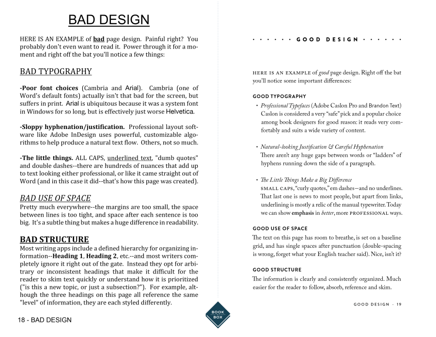
  3. Invest in professional interior formatting. The vast majority of self-published books are purchased from Amazon, and most of them feature the “look inside” element, which allows shoppers to view pages from within the book.  The interior of your book is the second way potential customers recognize self-published books. Interiors that are formatted by computers look like they were formatted by computers, and that makes them look like amateur, self-published books. Even worse, it looks like the author doesn’t care about what the book looks like.  If the author doesn’t even care what the book looks like, why should a potential reader buy it?
good-vs-bad-book-design_new

After the cover design, the interior design of your book is what separates most professional self-published books from “free” self-published books. Professional self-published books, like those published by full-service self-publishing providers, feature interior designs formatted by human beings.  “Free” self-published books, on the other hand, feature interior designs formatted by computers. The difference, when compared side by side, is staggering. Don’t allow your book to look amateurish and cheap by allowing a computer algorithm to format it for you. Your potential buyers will notice. They may not care who published it; they may think the cover looks great; but without a professional interior, they’re still going to know your book is self-published with just a glance. And, as a result, they’re going to think twice about ordering it.

Fortunately, it’s easy to make your book interior look professional.  Nearly all full-service self-publishing providers will professionally format your interior as a part of their publishing package fees.  And most will offer you the opportunity of “enhanced” or “custom” interior designs. Don’t pass on this opportunity lightly. While the standard interior formatting offered by most full-service providers is certainly better than anything a computer can do at those “free” places, enhanced or upgraded interior designs typically go one or two steps further – by integrating design elements, unique styles, and customizations to truly make your book one-of-a-kind. The improvement is usually worth the cost of admission.

Page-by-page custom interior designs are best suited for children’s books, or complex literature where the book itself is a work of art, like with some poetry or coffee table books. Rarely does a page-by-page custom design suit a typical black/white fiction or non-fiction work of average length (100-300 pages).  The result just doesn’t justify the cost.

When it comes to selecting a standard, included interior, do some research. Look at similar books in your genre and choose a similar style for your book.  While a cover should be unique and eye-catching, you don’t want your interior to rock the boat. Give the reader what they expect.

If you choose to enhance or upgrade your interior for a professional format that is more customized to your book and vision, work with your designer closely, and heed his/her advice. After all, this is what they do for a living; they know what they’re doing and their recommendations are worth their weight in gold. If you have a particular vision that contradicts your designer’s recommendations, have a strong, valid reason for going against conventions.  

If you choose to publish with a “free” publishing service, format your book in advance and save it as a PDF file. Do not allow their computers to “format” your book for you. That’s a sure way to make your book look self-published and, worse of all, cheap.  While formatting a book in Word is acceptable, and certainly preferable to computers, the better alternative is to use design software like inDesign. This is what professional designers use and this is what professional publishers use. Yes, your book’s interior design is that important. Most writers do not know how to design a book in inDesign, which, of course, is why most professional self-published authors use full-service publishing providers.


brent sampson
In 2002, Ernst & Young Entrepreneur of the Year Semi-Finalist Brent Sampson founded Outskirts Press, a custom book publishing solution that provides a cost-effective, fast, and powerful way to help authors publish, distribute, and market their books worldwide while leaving 100% of the rights and 100% of the profits with the author. Outskirts Press was incorporated in Colorado in October, 2003.
In his capacity as the Chief Executive Officer and Chief Marketing Officer, Brent is an expert in the field of book publishing and book marketing. He is also the author of several books on both subjects, including the bestseller Sell Your Book on Amazon, which debuted at #29 on Amazon’s bestseller list.

5 Steps to Creating a Culinary Cookbook

What separates good cookbooks from bad ones? Just like everyone’s individual palate, the answer to that is largely a matter of personal taste, but these five hints just may help keep your cookbook from leaving a bad taste in someone’s mouth.

cookbook

  1. Include full-color photographs
    The number one most important thing you can do for your cookbook is include high-quality, full-color photographs of the food. Rare is the self-publishing author who can afford to spring for a professional photoshoot, but with today’s cameras, some 3-point bounce lighting, and a photo editing program like Photoshop, there’s no reason to limit your 5-star tartare to a 3-star photograph.  There are simply too many cookbooks on the market to publish one without images, or in black & white.  The old adage says you can’t judge a book by its cover and while that is proven false time and time again, nobody ever said such a thing about a cookbook – where you definitely CAN judge it by its cover. And its cover better look delicious! And so should the inside!
  2. Include original, unique, and exclusive recipes
    No matter how appetizing the pictures look, there has to be a reason for someone to buy your cookbook.  Sure, the design might be amazing, and the images breathtaking, but content trumps design every time, and that is especially true for cookbooks.  Your target market already knows how to make spaghetti, pot roast, and shrimp cocktail; you have to include recipes they’ve never seen before, or at least feature startling new takes on old standards that will justify their purchase, as well as satisfy their cravings.
  3. Allow content and design to dance
    Speaking of design and content, formatting a cookbook is much like dancing the tango, with the content and the design making magical music together as they flow in unison. Cookbooks require larger print than other books because people don’t “read” cookbooks, they “use” them (typically with wet fingers or flour-caked palms).  So, if you have too many recipes to hit your target page count at 14- or 16-point font, don’t decrease the font size to 12 just to make it fit.  Remove a recipe. Or, better yet, find a way to reword those three-page recipes into two-page spreads.
  4. Include finishing flourishes
    A good meal is like a good story (or a good cookbook); it has a beginning, a middle, and an end.  Anybody can print a recipe for baked Alaska from the Internet but only your cookbook contains the amusing anecdote about how making it for the first time led to a food fight with your grandson, which turned into a fond memory told over Thanksgiving Dinner for years to come.  Don’t be afraid to sprinkle some saffron into your prose to excite the senses and make the recipes in your cookbook truly your own.
  5. Obsess over the details
    The details of your recipes can make or break your cookbook. This includes the ingredients, as well as the instructions, down to the units of measurements and the cooking equipment.  If your audience is comprised mostly of US residents, don’t refer to grams or liters when your cook wants to see teaspoons, tablespoons, or cups, instead.  If your recipe calls for a very specific ingredient that is not available at the local grocery store, advise your cooks where to get their hands on it – a farmer’s market, online, a quick trip to China, etc.  By the same token, be informative and detailed about the pots, pans, molds, presses, graters, utensils, etc. you’ve used to create your inspiring dishes.  The purists will appreciate the opportunity to match your expertise and it gives the lay-cook something other than their prowess to “blame” when their soufflé flops.

To make a soufflé you’ve got to break a few eggs, but nobody warned you publishing a cookbook would be such a headache. It doesn’t have to be! Check out this One-Click Cookbook package over at Outskirts Press.


brent sampson
In 2002, Ernst & Young Entrepreneur of the Year Semi-Finalist Brent Sampson founded Outskirts Press, a custom book publishing solution that provides a cost-effective, fast, and powerful way to help authors publish, distribute, and market their books worldwide while leaving 100% of the rights and 100% of the profits with the author. Outskirts Press was incorporated in Colorado in October, 2003.
In his capacity as the Chief Executive Officer and Chief Marketing Officer, Brent is an expert in the field of book publishing and book marketing. He is also the author of several books on both subjects, including the bestseller Sell Your Book on Amazon, which debuted at #29 on Amazon’s bestseller list.

The Book Beautiful: The Back Cover

It’s More Than a Graveyard for Details

A potential reader has your book in their hands, they look at the front illustration, they flip through and subconsciously note how the book it formatted, and then they turn the book around to read the back cover. The back cover becomes a crucial piece for a reader deciding whether or not they are going to purchase your book. You essentially have 150-200 words to sell your story to the reader, anything more than that will appear cluttered or have to be excruciatingly small in order to fit, alienating some potential readers who didn’t bring a magnifying glass along with them to the bookstore.That being said, a great thing to do before you begin brainstorming the back cover of your own book is to go through your own library and look at the back covers of some of your favorite books for reference.

Is your book fiction? If so, provide a short summary of what the story is about, including some enticing plot points to hook your reader in (don’t give the ending away!). An exciting way to end your back cover blurb is with a question or introducing a point of tension that the reader will feel compelled to explore further.

Is your book nonfiction? Begin by addressing the primary purpose of your book, or the ‘why’ a reader should choose your book. Proceed by making a bullet-point list of the topics your book will cover, i.e. what the reader can gain from reading your book.

Once your blurb is written, it’s time to introduce yourself as an author. A professional photograph of yourself (a face shot with no background noise, the focus is on you here) with a short bio is another essential component of a back cover. This bio won’t be as detailed as the formal bio on a page inside the book (or book jacket if a hardcover), and is not meant to be. If you are a nonfiction writer, this is a good place to list your qualifications, experience, or training in the area you’ve written about.

Endorsements are another appropriate feature to add to your back cover if you have them. An endorsement is just a short little quip written by a well-respected author in your genre (if fiction) or professional in your field (if nonfiction). If you don’t have someone well-known to endorse your book, it is best to omit this feature as it will simply look like you couldn’t obtain a more reputable endorsement and instead settled for anything.

If you’re struggling with any of the components of your back cover, Outskirts Press’ one click publishing package includes a personalized back cover that is professional and polished and relieves you of the stress of choosing the right few words to include to reel in potential readers.


Thank you for reading!  If you have any questions, comments, suggestions, or contributions, please use the comment field below or drop us a line at selfpublishingadvice@gmail.com.  And remember to check back each Wednesday for your weekly dose of marketing musings from one indie, hybrid, and self-published author to another. ♠


Kelly

ABOUT KELLY SCHUKNECHT: Kelly Schuknecht is the Executive Vice President of Outskirts Press. In addition to her contributions to the Outskirts Press blog at blog.outskirtspress.com, Kelly and a group of talented marketing experts offer book marketing services, support, and products to not only published Outskirts Press authors, but to all authors and professionals who are interested in marketing their books and/or careers. Learn more about Kelly on her blog, kellyschuknecht.com

The Book Beautiful: Formatting the Masterpiece

As you finish your manuscript and move toward the stage of publishing, the layout of the inside of your book (such as formatting, font choice, etc.) must come into serious consideration. The formatting of your book transforms your word document into a book, it brings your manuscript to life.

Now while many readers won’t spend much time musing over the careful ruminations that went into the formatting of a book, they will notice if that care hasn’t gone into your formatting. The formatting style you choose should not only reflect, but also enhance the overall feel and mood of your story. Even if the careful decisions you spend hours vacillating over are never consciously acknowledged by your reader, those decisions absolutely affect the reader’s subconscious perceptions and preconceptions of your book. For example, merely picking up a book and scanning through the pages will immediately tell a reader whether or not your book is professional, before they’ve even read a sentence. Among readers there is a certain unspoken, but expected standard for how a book should appear, thus, when a book falls short of that expectation it acts as a giant red flag that your title might not be worth purchasing. You want your book to ‘fit in’ with the other books on the shelf, you want it to look polished, legitimate, and professional.

open book formatting

Once you’ve caught the reader’s eye with a sleek, professional cover and they’ve started thumbing through the pages, something they will take subconscious note of is the font you’ve selected. Note that every time someone opens a word processor that Times New Roman is probably the pre-set font, meaning that if your book is in TNR, it won’t seem special or really pop before the reader’s eyes. There are thousands of appropriate fonts that will help your book stand out, so don’t be afraid to try something new; that being said, avoid over-the-top or childish looking fonts as well.

Further typography considerations to make are the number of characters per line, lines per page, spacing between words, etc. Think of those books you’ve read that have too many characters per line, the kind where you feel like the page or chapter is never ending. The satisfaction of turning pages and progressing to the next chapter is a thing a lot of readers enjoy–not to say you should have

HUGE FONT WITH HUGE SPACING …

… but tiny font with small spacing

isn’t great either. Find a happy middle ground. A further consideration, when there is little spacing between lines, the reader’s eye will often skip a line and they will then have to readjust and thus lose their engagement with your story. It’s a small detail, but it affects the reader’s experience which means that it’s not a trivial detail.

open book formatting

Another thing to consider: how far your text goes in toward the spine of the book. Paperback book readers know how frustrating it is when the text of the book they’re reading goes nearly all the way to the spine so they nearly have to crack it to see what you’ve written–don’t make your readers ruin your beautiful book!

The moral of the story is: don’t just settle for the bare minimum requirements of your publishing company. Treat the formatting process of the interior of your book with the same kind of tender love and care that you treated the writing and editing process with–your readers will notice, and you can rest confidently knowing that you’ve produced a well-thought out, professional book.


Thank you for reading!  If you have any questions, comments, suggestions, or contributions, please use the comment field below or drop us a line at selfpublishingadvice@gmail.com.  And remember to check back each Wednesday for your weekly dose of marketing musings from one indie, hybrid, and self-published author to another. ♠


Kelly

ABOUT KELLY SCHUKNECHT: Kelly Schuknecht is the Executive Vice President of Outskirts Press. In addition to her contributions to the Outskirts Press blog at blog.outskirtspress.com, Kelly and a group of talented marketing experts offer book marketing services, support, and products to not only published Outskirts Press authors, but to all authors and professionals who are interested in marketing their books and/or careers. Learn more about Kelly on her blog, kellyschuknecht.com

The Book Beautiful: The Cover

While the old adage “Don’t judge a book by it’s cover” is one all too oft repeated, we all know that we’ve been in a bookstore and picked up a book with an author and title we weren’t familiar with simply because the cover appealed to our senses in some way. That’s not to say that the heart of the matter isn’t what happens to be inside the book; I can just as easily recall how many times I’ve put down that same book with the interesting cover after scanning a few pages and deciding it wasn’t for me.

When you’ve completed a book that you’ve poured your heart, your soul, and countless hours into, it’s important that your piece physically reflects how beautiful of an accomplishment self-publishing can be. While the traditional means for designing a book cover happened to be very time consuming and left a lot of authors underwhelmed with the result, luckily for today’s authors, we live in a digital age which makes designing a book cover more exciting and involved (especially for a self-publishing author)!

Nowadays, you can ‘pin’, ‘Like’, and ‘Share’ graphics; better yet, you can share your potential book cover ideas on social media and get feedback from potential readers. You can get readers involved and have them vote on their favorite cover, or even host a contest that allows readers to submit cover ideas of their own! But perhaps we should backpedal before we get ahead of ourselves and ask what message do want your book cover to send?

As the author, you of all people know best what audience it is you are trying to target and the essential theme your book most embodies, be it: inspiration, achievement, mystery, romance, revenge, etc. etc. Once you’ve nailed down your audience and theme, the visual metaphors that you have to work with will become more obvious.

No matter who your audience is, you want them to be excited when they see the cover of your book. You want to stop people walking by the bookstore, or walking by the bookshelf, and you want to evoke their curiosity and pique their interest. If we take a look at the covers below we will see captivating images that begin to non-verbally communicate the scope of the story the author has also artfully fabricated:

When a book cover is able to explain the scope of a book, it allows the reader to save precious time wading through the myriad of titles in libraries and bookstores.

Remember when designing a book cover that sometimes less is more. The title, your name, and a striking image are often enough. Don’t feel the need to crowd the space with over-thought or crowded typography and definitely avoid stock images that could hurt your book’s credibility.  Need I give examples of cheesy, godawful book covers? No, but I will anyway.

I won’t annotate any further, as a picture is worth a million words.

Make sure the cover of your book, no matter how many words are inside of it, has a picture that is worth all the hard work you put into it. Remember that human beings are visual creatures and that the cover of your book is an important marketing tool. Be professional, be thoughtful, but also be bold!


Thank you for reading!  If you have any questions, comments, suggestions, or contributions, please use the comment field below or drop us a line at selfpublishingadvice@gmail.com.  And remember to check back each Wednesday for your weekly dose of marketing musings from one indie, hybrid, and self-published author to another. ♠


Kelly

ABOUT KELLY SCHUKNECHT: Kelly Schuknecht is the Executive Vice President of Outskirts Press. In addition to her contributions to the Outskirts Press blog at blog.outskirtspress.com, Kelly and a group of talented marketing experts offer book marketing services, support, and products to not only published Outskirts Press authors, but to all authors and professionals who are interested in marketing their books and/or careers. Learn more about Kelly on her blog, kellyschuknecht.com