Welcome to the sixth episode in our ongoing series about the myriad difficult decisions a self-publishing author makes in the process of pursuing publication! In previous weeks, we’ve discussed:
- Choosing a Self-Publishing Company,
- Choosing a Trim Size for Your Book,
- How to Know Thyself (& Thy Genre),
- Settling on a Price,” and last week we looked at
- Choosing a Cover.
But just as the decisions about the outside of your book are important, so too are the decisions you make about the inside. That’s right, we’re talking about:
Illustrations & Formatting
OR: the ‘look and feel’ element.
We all know how important it is that your book look good on the outside, so that new readers will pick it up off of the bookstore shelf (or the library shelf) and have that immediate “AHA!” moment. The problem is, while first impressions like these are one make-or-break moment for your relationship with your reader, so too is the moment when they thumb through the pages and take a look at the actual pages. Most readers I know will crack a cover open before committing to taking a book to the check-out (or circulation) counter, so–what gives? What elements of your book’s interior design will give a resounding second cheer to the good impression made by your book’s beautiful front cover?
ILLUSTRATIONS
As good a place to start as any, let’s take a look at illustrations and what role they play in a reader’s impression of your book. First off, let’s clear the air: we recognize that the appeal of any single illustration is largely a matter of taste, and we’re not here to cast aspersions or shame at any self-publishing author’s style of illustration. Many self-publishing authors crave the option to illustrate their own books, so there’s a wholeness of purpose sometimes behind illustrations that don’t immediately appeal to us–but again, that’s not what we’re really talking about here.
Take a look at these illustrations, all of which are courtesy of books my employer (Outskirts Press) has published in the past:
You can see that’s there no one common thread connecting them all. They’re all different styles, all different degrees of visual impact. They’re as unique as the books that give them a home.
Professional illustrations like these give your book an oomph–a real kick of appeal–that your book wouldn’t have without them. But are they appropriate for every book? Probably not. You might see how one style of illustration–simple, cartoonish, minimal–might fit perfectly in a children’s picture book, and how something a little more stylistically complicated–with detailed, fine pencil work–might fit well in a book for older readers, perhaps young teens. Novels for adults don’t often have illustrations–which isn’t to say they shouldn’t–but this may also be a question of audience. And one might imagine contexts–a cookbook with historic recipes, for example, or a book involving complicated geography–might benefit from a couple of beautiful illustrations. The key is to know thy audience and to make sure any illustrations you include are as polished and professional as they can be.
FORMATTING
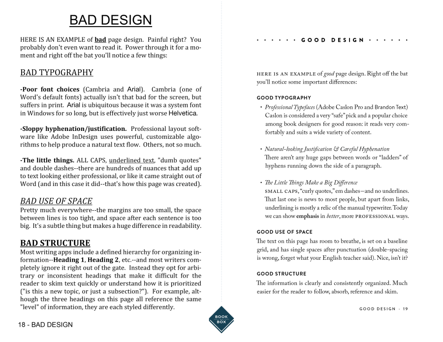
Ugh, now we’re really getting down to the nuts and bolts of your book aren’t we? But your book’s formatting is a vital component of whether it can hold a new reader’s attention or not. There’s nothing more frustrating than feeling like you’re being made uncomfortable by a book’s layout–and there are some rather well-research theories out there to explain why dense paragraphs, poor kerning or character spacing, poor font choices, and a poor handle on the virtues of white space can doom a book. Without getting lost in the details, it’s rather easy to summarize the visual impact of bad vs. good formatting with the following comparison:

Sound complicated? It can be. But it’s mostly a matter of balance, and consistency.
If you’re feeling … at sea, don’t worry. As with good cover design and illustrations, there are quite a few resources out there to help you navigate the decisions that await–including whether or not you should outsource some of your design sensibilities to a paid professional. We’re one resource, and companies like Outskirts are another, and there are plenty–and I mean an almost obscene number–of self-help guides out there. The problem is, as it is with many things in the Internet age, that it’s almost impossible to know where to start. And that’s why we’re here! If you have design or formatting questions, give me a shout-out here on our blog, or track me and my compatriots down where we work.
You are not alone. ♣︎


