In Your Corner: The Guts of the Thing

Welcome to the sixth episode in our ongoing series about the myriad difficult decisions a self-publishing author makes in the process of pursuing publication!  In previous weeks, we’ve discussed:

But just as the decisions about the outside of your book are important, so too are the decisions you make about the inside.  That’s right, we’re talking about:

Illustrations & Formatting

OR: the ‘look and feel’ element.

We all know how important it is that your book look good on the outside, so that new readers will pick it up off of the bookstore shelf (or the library shelf) and have that immediate “AHA!” moment.  The problem is, while first impressions like these are one make-or-break moment for your relationship with your reader, so too is the moment when they thumb through the pages and take a look at the actual pages.  Most readers I know will crack a cover open before committing to taking a book to the check-out (or circulation) counter, so–what gives?  What elements of your book’s interior design will give a resounding second cheer to the good impression made by your book’s beautiful front cover?

ILLUSTRATIONS

As good a place to start as any, let’s take a look at illustrations and what role they play in a reader’s impression of your book.  First off, let’s clear the air: we recognize that the appeal of any single illustration is largely a matter of taste, and we’re not here to cast aspersions or shame at any self-publishing author’s style of illustration.  Many self-publishing authors crave the option to illustrate their own books, so there’s a wholeness of purpose sometimes behind illustrations that don’t immediately appeal to us–but again, that’s not what we’re really talking about here.

Take a look at these illustrations, all of which are courtesy of books my employer (Outskirts Press) has published in the past:

You can see that’s there no one common thread connecting them all.  They’re all different styles, all different degrees of visual impact.  They’re as unique as the books that give them a home.

Professional illustrations like these give your book an oomph–a real kick of appeal–that your book wouldn’t have without them.  But are they appropriate for every book?  Probably not.  You might see how one style of illustration–simple, cartoonish, minimal–might fit perfectly in a children’s picture book, and how something a little more stylistically complicated–with detailed, fine pencil work–might fit well in a book for older readers, perhaps young teens.  Novels for adults don’t often have illustrations–which isn’t to say they shouldn’t–but this may also be a question of audience.  And one might imagine contexts–a cookbook with historic recipes, for example, or a book involving complicated geography–might benefit from a couple of beautiful illustrations.  The key is to know thy audience and to make sure any illustrations you include are as polished and professional as they can be.

FORMATTING

Ugh, now we’re really getting down to the nuts and bolts of your book aren’t we?  But your book’s formatting is a vital component of whether it can hold a new reader’s attention or not.  There’s nothing more frustrating than feeling like you’re being made uncomfortable by a book’s layout–and there are some rather well-research theories out there to explain why dense paragraphs, poor kerning or character spacing, poor font choices, and a poor handle on the virtues of white space can doom a book.  Without getting lost in the details, it’s rather easy to summarize the visual impact of bad vs. good formatting with the following comparison:

book formatting

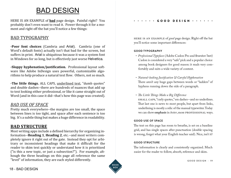
Sound complicated?  It can be.  But it’s mostly a matter of balance, and consistency.

If you’re feeling … at sea, don’t worry.  As with good cover design and illustrations, there are quite a few resources out there to help you navigate the decisions that await–including whether or not you should outsource some of your design sensibilities to a paid professional.  We’re one resource, and companies like Outskirts are another, and there are plenty–and I mean an almost obscene number–of self-help guides out there.  The problem is, as it is with many things in the Internet age, that it’s almost impossible to know where to start.  And that’s why we’re here!  If you have design or formatting questions, give me a shout-out here on our blog, or track me and my compatriots down where we work.

You are not alone. ♣︎


Elizabeth

ABOUT ELIZABETH JAVOR: With over 18 years of experience in sales and management, Elizabeth Javor works as the Manager of Author Services for Outskirts Press. The Author Services Department is composed of knowledgeable publishing consultants, pre-production specialists, customer service reps and book marketing specialists; together, they all focus on educating authors on the self-publishing process to help them publish the book of their dreams. Whether you are a professional looking to take your career to the next level with platform-driven non-fiction or a novelist seeking fame, fortune, and/or personal fulfillment, Elizabeth Javor can put you on the right path.

In Your Corner: Choosing a Cover

Welcome to the fifth entry in our current and ongoing series–a series in which we examine some of the many choices which you will have to make as an author entering the world of self-publishing: choices ranging from the all-important “Choosing a Self-Publishing Company” to the nuts and bolts of “Choosing a Trim Size for Your Book” to figuring out how (and when) to “Know Thyself (& Thy Genre).” Last week, we felt our way through the topic of “Settling on a Price,” but this week we’re going to take a slightly different tack.  We’re going to look at the book as a physical object–and in fact, we’re going to look at the most defining feature of a book as a physical object:

Choosing a Cover

Piqued your interest yet? Good.

Here’s the thing about covers: we know a good one when we see one, and a bad one too, but we don’t often know the reasons why–we just … do–and knowing why a cover design works or doesn’t work is a crucial skill to develop as you yourself set about designing a book cover of your own.

GOOD NEWS FIRST. OR MAYBE GOOD COVERS INSTEAD.

Take a look at these, a few of my favorite covers from my time working at Outskirts Press:

Does anything jump out at you?  They’re all rather different, which makes sense given the fact that they’re appealing to different audiences.  Remember talking about audiences when we talked about genre?  Book covers are all about expressing the essence of your book’s content, and doing so in a common language shared with your ideal readers.  And readers are smart.  They’ve been reading a long time, and they know the visual cues that indicate a book’s atmosphere, or aesthetic.  Books of a self-help or nonfiction nature, for example, often present uncluttered, minimalist covers with people enacting some behavior connected to the theme (see Surviving Divorce God’s Way and Do You Know the Story of Superman?, above). Young Adult (YA) books, on the other hand, are targeting an age group interested in adventure and often romance, so the rich colors and exotic lettering of The Avant Champion are attuned to these expectations.

So much for expectations–what about execution?  A good book cover is more than just the sum of its parts, isn’t it?  There’s something to the way the parts are put together visually that matters.  That matters a great deal.

BAD NEWS NEXT. OR RATHER, BAD COVERS.

Everyone loves a bad book cover–the same way everyone loves a terrible audition for American Idol–in that we only enjoy witnessing someone else messing up badly.  When we mess up as authors, sales do not go well for us.  And sales are important.  And so, without being uncompassionate or trite, take a look at these covers:

Pretty bad, right?  But why?  Is it the hazy images or the busy backgrounds or the lack of contrast or the obnoxious font choices or the general impression that someone put these together using Microsoft Paint?

The thing is, we get it.

Making covers is hard, and not everyone has an eye (or software program) to make a brilliant, eye-catching, solidly designed cover.  So we’re not laughing behind our hands at bad covers; we are, however, wiser for exposure to some of the ways in which we might go astray.  Using a sub-par program or manipulating already poor quality images can never give us the perfect cover, and not having the time or expertise to download the perfect font can put us under, too.

The critical components to an eye-catching cover don’t come naturally to most of us.  But if you see yourself in this sentence, I have good news.  There are actually quite a lot of resources out there to help you, from self-help guides built in to self-publishing website like Amazon to the professional services offered by companies like the one I work for.  I’ve even known a couple of authors to make personal contact with illustrators and graphic designers on their own and see some success that way.  The key is to know your strengths and to be realistic about your weaknesses, and to accept help when you reach the end of your own capabilities.

You are not alone. ♣︎


Elizabeth

ABOUT ELIZABETH JAVOR: With over 18 years of experience in sales and management, Elizabeth Javor works as the Manager of Author Services for Outskirts Press. The Author Services Department is composed of knowledgeable publishing consultants, pre-production specialists, customer service reps and book marketing specialists; together, they all focus on educating authors on the self-publishing process to help them publish the book of their dreams. Whether you are a professional looking to take your career to the next level with platform-driven non-fiction or a novelist seeking fame, fortune, and/or personal fulfillment, Elizabeth Javor can put you on the right path.

In Your Corner: Settling on a Price

We’ve been at it for a few weeks now, examining a few of the many choices authors have to make during the self-publication and marketing processes, starting with the Big Whopper (“Choosing a Self-Publishing Company“) middling with the choices authors make regarding the text itself (“Choosing a Trim Size for Your Book“), and winding through deciding on a genre for your book–assuming, of course, that genre remains a useful identifier (“Know Thyself (& Thy Genre)“).  Today, we’re going to look at something a little different.  We’re going to ask the money question.  (Or … one of the money questions.)

How Much Do I Charge Per Book?

I’m already aware it’s complicated. Just tell me already.

It’s true.  Pricing is complicated, not least by the fact that we’re probably looking at two different products here, even when we’re talking about one book–because let’s face it, it’s a good idea to sell both a digital copy or ebook edition as well as a physical copy or print edition of your book.  The more diverse your offerings, and so on and so forth.

price in euros

Some facts hold true no matter which edition you’re looking at, however.  The first being:

  • Pricing your book too high relative to your competitors all but guarantees your readers will go elsewhere.

Readers are whatever the book version of an omnivore is called.  (A genrevore?  Never mind.  I’m terrible at coining memes.)  They’re far more likely to pick a sequel of a book they’ve already read than a book by a new author, and failing that, they’re more likely to pick a book within the same genre as an existing favorite.  But a book by an unfamiliar author that’s expensive compared to its shelfmates?  Not going to happen.

The second fact?

  • Pricing your book too low undercuts the perceived value of your book, unless the pricing is temporary.

When we talk about selling readers on a new book, we’re actually making a value proposition; we are attempting to cultivate a perceived value of the book in someone who has never encountered it before, and there’s nothing that shouts “Not worth my time!” than something that doesn’t come with its own built-in novelty factor. There should be a synergy between the quality of your book as an object in the hand and its price; and unless you’re creating the aforementioned novelty by running a short-term sale or discount, your book should be only fractionally lower than the average price of a new book in its genre.

Thirdly:

  • Print books need to account for physical manufacture costs.

So, yes, your ebook should probably cost less than your print edition. It follows.

And lastly:

  • Price is a question of audience.

What does your audience expect of a book like yours?  I’m not just talking about genre; I’m talking about length (Wolf Hall costs more than Moll Flanders, for example), paper and binding quality, whether it’s an oversize or mass market size, hardback or paperback.  The only real way to make a thoroughly researched decision on what these expectations mean in terms of pricing in today’s market is to wander through a bookstore.  Don’t just hang around in one section, either–walk every aisle.  Eye every book.  What qualities does your book share with each item?  What makes it stand out?  Flip through books of a similar page count.  Turn a few books with similar cover designs and aesthetics over to check the price.  Check the gloss of the pages.  Count the illustrations.

Ultimately, the price of your book can only be set and determined by you, so you will at some point have to just make a call and stick with it.  But if you’re feeling particularly brave, take your book in to a bookseller and without giving them much of a clue, let them handle the book and try to guess the price.  Let them estimate how much they would charge.  Neighborhood and indie bookstores are the best for this.  There’s no substitute for experience, and there’s not substitute for the assurance that you’re part of a larger network and system dedicated to putting books like yours in the hands of eager readers.

You are not alone. ♣︎


Elizabeth

ABOUT ELIZABETH JAVOR: With over 18 years of experience in sales and management, Elizabeth Javor works as the Manager of Author Services for Outskirts Press. The Author Services Department is composed of knowledgeable publishing consultants, pre-production specialists, customer service reps and book marketing specialists; together, they all focus on educating authors on the self-publishing process to help them publish the book of their dreams. Whether you are a professional looking to take your career to the next level with platform-driven non-fiction or a novelist seeking fame, fortune, and/or personal fulfillment, Elizabeth Javor can put you on the right path.

In Your Corner: Know Thyself (& Thy Genre)

Over the last couple of weeks, I’ve spent some time looking a few of the many choices authors have to make during the self-publication and marketing processes, starting with the Big Whopper (“Choosing a Self-Publishing Company“) and then moving into choices regarding the text itself (“Choosing a Trim Size for Your Book“).  This Thursday, however, I’m writing less about making a choice than I am about detecting past choices you may not have been aware you were making … and then totally exploiting them for marketing purposes.

Let me explain.

You Don’t Choose A Genre So Much As Discover It:

It Probably Only Matters for Marketing Anyway

Thinking back over the history of publishing, I can’t begin to count the number of times a book has been rejected as “too weird” or “too out-there” when really, the issue at hand was the fact that the book in question didn’t fit neatly into one of the prescribed genres (Fiction, Non-Fiction, Fantasy/Science Fiction, Western, Biography, etc).  And the marketing folks at a traditional publisher know: it’s hard to market something that doesn’t fit neatly into a category, because doing so requires flexibility and out-of-the-box thinking.  Hybrid thinking.  Opinions are changing, slowly, but not fast enough within the Big Five traditional publishing houses.

Self-publishing gives you a third way. You don’t have to pick a genre while writing, but you can take advantage of a book’s genre or genres plural by approaching genre as a diagnosis after the fact, and an expedition in search of what the Atlantic’s Noah Berlatsky calls “a ‘web of resemblances’ created by intertexual references” that are “constituted basically by social and cultural agreement,” quoting John Rieder and Jason Mittel.  It’s a hunt for markers that point you toward certain resemblances … resemblances you can capitalize on for their social currency.

genre

The diagnosis process is simple:

  1. What books have you read that influenced your work in a measurable way?
  2. What books on the shelves in bookstores now bear resemblance to yours in style and content?

Once you sketch out a couple of lists to answer this question, it’s time to hit the bookstore and your library.  Libraries tend to scale the number of genre sections they stock according to how much shelf space they have, so bigger libraries will have finer distinctions between genres, while bookstores tend to pick the genres they’re going to stock according to what’s popular.  If you survey both your local Barnes & Noble, Tattered Cover, or (*gasp*) actual real-life physical Amazon Bookstore as well as your local public library, you’ll pick up on some of the more common genres out there, including:

  • Action/Adventure
  • Biography
  • Fantasy/Sci-Fi
  • Horror
  • “Literary” Fiction
  • Mystery
  • Thriller/Suspense
  • Romance
  • Self-Help
  • Westerns
  • Women’s fiction

But the list could be a lot, lot longer.  I haven’t, for instance, mentioned more obscure genres like Steampunk and Grimoire.

Once you’ve found the shelf or shelves on which you could picture your book sitting in a bookstore or library, you’re ready to start integrating genre into your publishing and marketing processes.  Now, your book may have “resemblances” to any number of genres, but for simplicity’s sake it’s a good idea to pick just one or two that have left very clear thumbprints on your text.  You can take a quick poll of your early readers, or consult the professionals, for what they find most striking about the style and tone and voice of your book if you end up stuck for answers.  And before committing to your genre or genres, you’ll want to consider your readership.  What are they likely to connect to the most in terms of language?

Genre safely discovered and stowed away for future use, it’s time to start putting it to work.  The language of genre is rich with possibility in terms of “buzzwords” for marketing purposes, so sow them liberally amongst your back-cover blurbs, your press releases, your Amazon and Goodreads listings, your website and blog posts, as well as your social media interactions.  (Genres like #biopunk and #horrorlit make for great hashtags, don’t you think?)

There are lots of ways to use genre once your book is already written and ready to meet the world…but remember, it’s all a matter of timing.  You don’t need to write your entire book to meet a genre’s proscriptive requirements…just your promotional materials.  Genre can be confining, so it’s best to bring it into play only after the creative work is already done.  In my opinion.

You are not alone. ♣︎


Elizabeth

ABOUT ELIZABETH JAVOR: With over 18 years of experience in sales and management, Elizabeth Javor works as the Manager of Author Services for Outskirts Press. The Author Services Department is composed of knowledgeable publishing consultants, pre-production specialists, customer service reps and book marketing specialists; together, they all focus on educating authors on the self-publishing process to help them publish the book of their dreams. Whether you are a professional looking to take your career to the next level with platform-driven non-fiction or a novelist seeking fame, fortune, and/or personal fulfillment, Elizabeth Javor can put you on the right path.

In Your Corner: Choosing a Trim Size for Your Book

Decisions, Decisions

(where would we be without decisions?)

When it comes to choosing the form in which your book will be sent forth into the world–hardcover, paperback, small, or large–it’s the rare author who has considered the book’s actual trim size.  Those other elements?  They’re easy to visualize in your head, to picture your book as taking one such form.  Trim size is not so easy, in part because many authors don’t even know what the term means.

trim size definition

Thanks to Dictionary.com, we can safely interpret trim size to mean the page area left after final production is completed–which is not the same thing as the page area throughout the printing process.  While a book is being printed, the pages are slightly larger than their final size.  Once your content has been printed, the pages are cut down to their final size–their trim size.

Depending on which self-publishing company you choose, you ought to have a choice of trim sizes to select from.  Print on Demand (POD) options will often constrain your choices simply because each size uses its own machinery, so the more sizes on offer = the more expensive the machinery is to purchase and maintain for the operator, and ultimately, the end user–you.

There are so many sizes to choose from, it almost boggles the mind.The most common trade paperback sizes, for example, run from 6″ by 9″ to 5.5″ by 8.5″, but you’ll also see 5.25″ by 8″ and 5″ by 8″ in some POD services. It’s not unheard of to choose even larger sizes–6″ by 9″, 7″ by 10″, 8.25″ by 8.25, or even 8″ by 10″–especially if you’re working within the children’s picture book or technical manual markets.

trim size
[ a pleasant-looking trim size ]
Sometimes the decision might be self-explanatory.  If you’re a photographer, for example, it makes sense to go with a larger trim size to allow your images to be shown off to greatest effect.  But why does size–or even deciding between hardcover and paperback– matter at all to everyone else?  The answer boils down to reader perception, and reader perception can be greatly affected by the minutiae.  A nice balance between text and white space, for example, is a subconscious clue that the author took great pains to be professional while designing their book.  A crowded page, while maximizing the text-to-page ratio and lowering the total page count (and therefore cost) of a book, looks clunky and dense, making it difficult to read.  Similarly, a hardcover book is a sign that, on a fundamental level, the author cares about creating a durable, treasured possession–while a paperback enables portability and a voracious consumption of words.

Think about how your book will be used, and by whom, and what the typical expectations are within a genre.  Fiction titles typically run in smaller trim sizes, since readers typically read them for pleasure–whether on the train to work in the morning, or while sitting on the back porch.  Nonfiction titles, including memoirs and the ever-growing Creative Non-Fiction (CNF) field typically run in the middle of the pack–unless they’ve been penned by someone famous, like a film or a football star.  Those are often oversized, just like the personalities they describe.  Technical manuals, cookbooks, photography tabletop books, and children’s picture books are always the largest books on the shelf–and often, they are used while lying flat on a table or the floor.

I guess my recommendation is rather simple: take a ruler with you to the bookstore and library.  Measure the books that fall within the “if you like my book, you might also like X book” category, whether you’re thinking of similarities in genre or thematic content.  Weigh it in your hand.  Are you more likely to pick up the hardcover or the paperback of that book?  And don’t just measure the outside cover.  Look inside–at the trim size, the the margins.  It may not be an easily quantifiable thing, but readers are most likely to buy books that strike them as visually balanced and attractive–and the trim size of a book contributes to this a great deal!

You are not alone. ♣︎

*  And when Thomas himself took the poem seriously and made some rather intense life choices–for example, going off to WWI–Frost was devastated.  He was even more devastated when Thomas died in Arras.  The moral of this story being, it would seem, to make major life decisions upon thorough research and consideration, not the (misread) interpretation of a poem.

Elizabeth

ABOUT ELIZABETH JAVOR: With over 18 years of experience in sales and management, Elizabeth Javor works as the Manager of Author Services for Outskirts Press. The Author Services Department is composed of knowledgeable publishing consultants, pre-production specialists, customer service reps and book marketing specialists; together, they all focus on educating authors on the self-publishing process to help them publish the book of their dreams. Whether you are a professional looking to take your career to the next level with platform-driven non-fiction or a novelist seeking fame, fortune, and/or personal fulfillment, Elizabeth Javor can put you on the right path.